

Jan 22, 2025
So you’ve created a plan to improve a process and it blundered spectacularly. What do you do now?
Even the best-laid plans can fail. An important part of quality improvement (QI) is to review your process, from start to finish, and pinpoint where things may have taken a turn. One way to do that is to map out the problem and potential root causes and find a link between them using a fishbone diagram.

- What is it?
- What are the benefits of using a fishbone diagram?
- How to create a fishbone diagram.
- Making fishbone diagrams work for you
What is it?
A fishbone diagram (also be called a cause-and-effect diagram or an Ishikawa diagram, named after its inventor, Karou Ishikawa) is a useful evaluation technique and effective component. A fishbone diagram can help:
- Identify the possible root causes—the basic reasons—for a specific effect, problem or condition
- Sort out the interactions among factors affecting a particular process
- Analyze existing problems so that corrective action may be taken
- Visualize the relationships of potential causes to one another and to the resulting effect
What are the benefits of using a fishbone diagram?
The structure provided by the fishbone diagram helps team members drill down and find the root cause of a problem or effect. Aside from encouraging group participation, this collaborative approach allows teams to think in a very systematic way.
Furthermore, the visual component is an orderly, easy-to-read diagram that identifies gaps in a process or areas where further study is needed. As a result, team members can separate a problem (or problems) from a final result and gain clarity on how to improve.
How to create a fishbone diagram
When you develop a fishbone diagram, you are constructing a pictorial display of a list of causes organized to show their relationship to a specific effect.
Step 1: Identify and define the outcome you’d like to analyze
Decide on the effect or end result you’d like to examine. These can be quality characteristics, problems resulting from work, planning objectives, etc. An effect may be positive (an objective) or negative (a problem), depending on the issue being discussed.
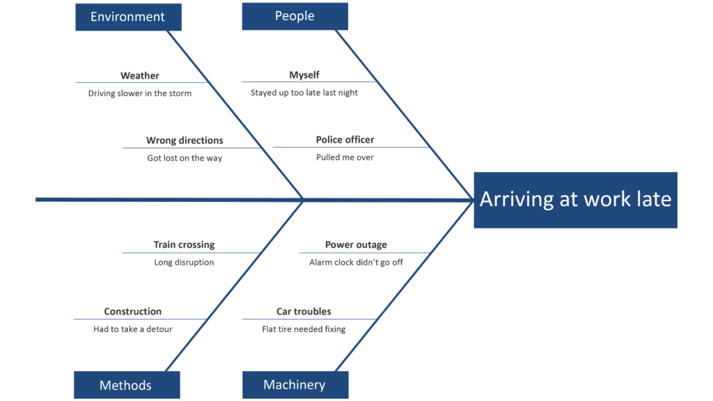
For this example, we’ll visualize the characteristics of something that most people have experienced at least once in their life: arriving late to work.
Step 2: Create the diagram
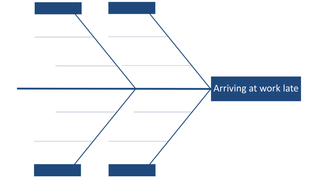
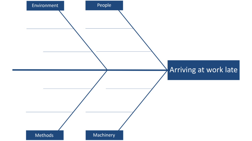
On a large piece of paper, draw a straight horizontal line—think of it as a fish spine. (Alternatively, you can use whiteboard programs such as Miro, Mural, Canva or Microsoft PowerPoint to map out a fishbone digitally.) At the far right of the spine, write out the effect/outcome of the process you’re examining—this becomes the head of the fish.
Now it’s time to plot the categories along the fish spine. These are the labels for the major branches of your diagram and become categories under which to list the causes related to those categories.
Note that there is no correct or set amount of categories, and there will likely be some variance depending on your line of work. For example, service industries may examine policies and procedures, while the manufacturing sector may list environmental factors. Use your judgement to select the categories that make sense for the diagram you are creating. Common categories typically include materials, methods, equipment, environment and people.
Draw these category lines diagonally above and below the spine—these will serve as the bones—and label them with your selected categories.
For each category, identify other specific factors which may be the causes of the effect. Identify as many causes or factors as possible, and attach them to the sub-branches of major branches. You can do this by asking “why”– try to keep asking this question until you have no further answers (a technique like the Five Whys can really help you drill down). Keep asking why to get to the underlying causes.
Fill in details for each cause. You can add additional branch bones off any bone to demonstrate sub-causes.
Throughout the process, be mindful to identify causes rather than symptoms. Missing a meeting, for example, would qualify as a symptom of being late—not a cause.
Step 3: Analyze the diagram
With the data laid out, you can start to look for patterns and identify causes that warrant further investigation. Look at the balance of your diagram, checking for comparable levels of detail for most of the categories. A thick cluster of items in one area may be a bigger influence to the effect, and can indicate a need for further study. On the other hand, a main category having only a few specific causes may indicate a need to identify further causes.
Look for root causes that appear repeatedly, as they may influence the effect you are seeing, and will likely need to be addressed. You’ll also want to look for what you can measure in each cause so you can quantify the effects of any changes you make.
If you are in a team environment, you may wish to vote on three common causes or occurrences. Identify and circle causes you can act on immediately and note those that may require more time or clarity.

Collaborating with your team will help you determine priority areas to work on. As with many QI tools, the power of the tool is in the conversation it generates.
Making fishbone diagrams work for you
The fishbone diagram is a useful QI tool that may identify the root cause (or causes) of an issue. Its graphical nature lends itself to those who process information visually or spatially. Moreover, it displays numerous potential causes at once—ensuring that, in a team setting, everyone is on the same page. This collective snapshot helps build group consensus around the issue at hand and how it can be improved.
Resources
- American Society for Quality – What is a Fishbone Diagram?
- Reliable Planet – Determining Cause and Effect